world values survey

i was talking with my friend fredrick hellstrom, from sweden, tonight who has a cool blog entitled the nordic influence. we talked about a lot of things, and he was sharing with me how things were in his country. it was a fascinating conversation. it reminded me of my visit to copenhagen and malmo about a year ago with my friend tijmen who lives in the netherlands.
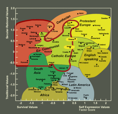
anyway, when fredrick and i were together, we did a little surfing on the web. as we were surfing we came across a values map that he had previously blogged on in the past that one of his fellow bloggers was blogging on now. it is a world values map that shows where different countries line up on different axis.
the north/south axis is where countries line up as far as traditional/secular-rational, while the east/west axis reflects where a countries lines up in regard to survival/self-experession.
in regard to the tradition vs secular, this is primarily indicating the contrast between societies in which religion is very important (traditional) and those societies where it is not. (secular-rational) in regard to the survival - self expression axis, this deals with weather countries have a strong emphasis on economic and physical security (survival) or if they have an increasing emphasis on subjective well-being, self expression and quality of life. (self-expression)
this map entitled the inglehart values map was put together as one of many expressions of the data that was collected by social scientist from all over the world in the fourth wave of the world values survey. the findings from this extensive survey were presented by thorleif pettersson, ronald inglehart and juan diez-nicolar to a special session of the swedish parliment.
now while data as we know can be interpreted many ways, i think anybody interested in missions might find something to learn from this map and from these extensive surveys.


5 Comments:
JR! Thanks for the food and for your time. I really appreciate that. I'm sorry I couldn't make it to the service today. I had to prepare for the coming days when I'm off to New Mexico. I hope we can share pictures anyway. Let's keep in touch. I posted a nice picture of you on my blog. Now everybody can see how glad you are having a Mac! :)
It's an interesting survey (a couple of professors i work with use the WVS a good bit), with alot there, and i think that the image you show here is one that shows some interesting things. But they're largely masked by the way its presented. As you mentioned, there are always problems with the way things can be presented, and i think that this image typifies one of the biggest missteps there in much of Ingelhart's work. i can see why they try to group countries by continent for some continuity for the audience. He likes to group things the way he likes to group things then makes them seem naturally salient. There are no "natural" groupings in the figure you show there, a fact that is masked by the geographical colorings. This is something that i have thought alot about, and there is an interesting book on (interesting probably only to social scientists, but i thought this was an ok time to chime in on that one). When people like Inglehart, who does have alot of knowledge and expertise in knowledge of things like what this image includes, tries to break his knowledge down into tidbits that are "digestable" by those who do not have comparable knowledge, often you get presentations that are very tempered by the one presenting's biases.
[steps off of soapbox and returns to blog reading.]
oops, left out the book link.
i love that diagram. very cool! thanks for sharing...
thanks a lot for you thoughts jimi. i really appreciate it, knowing your area of study.
Post a Comment
<< Home